

Design system
Leon Paul Style Guide
The visual language for leonpaul.com — colours, type, components and layout rules, aligned with the current live site.
Logos
Use the dark artwork on light backgrounds and the light artwork on dark backgrounds. SVG previews are shown below; use the linked PNG files when a raster asset is required.


Colors
Near-black carries the brand. Orange is an accent, used sparingly. One orange only.
Brand balance — black and white do the work; orange is an accent at roughly 5–10% (link hover, small highlights). Matched to leonpaul.com.
Sale red
#BE0101 · sale price, cart count, link active
Highlight green
#28BA52 · eyebrows on product cards
Orange in use
Accent, ~5–10% of any layout · link hover only
Typography
Inter throughout, weights 400–800. Headlines take tight negative tracking. Eyebrows are always black — never orange.
Eyebrow · 600 · 12px · .12em · blackGeneration LP
H1 · 700 · 52/1.03 · −1px21st Century Fencing
PLP title · 800 · 48/1.05Sabre Blades
Result count · 600 · 16px2 Products
H3 · 700 · 24/1.15 · −0.3pxForged in London. Scored without wires.
Body · 400 · 16/1.6 · #575757A century of London craft, in kit built for the way you fence today. Sentence case, British English, no exclamation marks.
Card eyebrow · 400 · grey or greenThe Pinnacle of DesignUltra Lightweight
Product name · 500 · uppercaseApex FIE Womens Jacket
Price · 600 · 19px + INC VAT£314.20Inc VAT
Buttons & chips
Every button is a pill — weight 700, no arrows. Black and soft grey swap on hover. Hover the samples to try it.
Primary — black · hover grey
Wishlist
Medium
Small
Disabled
#1A1A1A fill, white text · hover swaps to #E8E8E8 fill, black text. Sizes: large 17px / 16×32 pad · medium 15px / 13×26 · small 14px / 10×20.
Secondary — soft grey · hover black
Wishlist
Compare
Share
More
#E8E8E8 fill, black text · hover swaps to black. Icon prefix / suffix: buttons take an optional leading or trailing Feather icon at 16px (e.g. Share on PDP). Not widely used, but part of the system.
White — on light backgrounds
Right Hand
Left Hand
White fill, 1px #CCCCCC border, bold black text — used on white/light surfaces (PDP options like Hand, Grip Size). Hover swaps to black.
On dark — primary & secondary
Shop the range
Our story
Primary on dark: white fill, black text · hover #E8E8E8. Secondary on dark: 1px rgba(255,255,255,.5) outline · hover solid white.
Variant selector pills (PDP options)
Tang Length *
Long / French Grip
Short / Pistol Grip
Unselected: white fill, 1px #CCCCCC border, bold black text. Selected: black fill. Bold label with red asterisk when required.
Chips — popular searches (search dropdown)
Popular Searches
Shoes & Socks
Clothing
Grey #EDEDED fill · black text 17px · 13×24 padding · no border.
Forms & inputs
Inputs and dropdowns share one treatment: grey #F6F6F6 fill, no border, 10px radius. Labels are bold with a red asterisk when required.
First Name *
Email
you@club.com
56px tall · 18px side padding · label 17px weight 700 · required asterisk #E02020 · placeholder #949494.
Sabre Blades
2 Products
Sort dropdown shares the input treatment — #F6F6F6 fill, 10px radius, chevron-down. Shown in context of a PLP header: heavy title + bold result count.
Quantity stepper
1
44px grey #E8E8E8 circles with − / + · value in a #F6F6F6 10px-radius field. Used on PDP quantity.
Tabs
Log In
Sign Up
Active tab: orange text + 4px orange underline on a grey track — one of the few sanctioned uses of orange (account screens).
Product cards
Image, optional eyebrow (grey or green, regular weight), then always a hairline above the uppercase title — the eyebrow slot keeps its height, so titles align across a row. VAT note is INC VAT in capitals.
Desktop
The Vertex Bag
£422.30 - £580.70Inc VAT
The Team Bag
£283.20Inc VAT
Duo Backpack
£83.30Inc VAT
Duo Weapon Bag & Backpack
£95.40£114.50Inc VAT
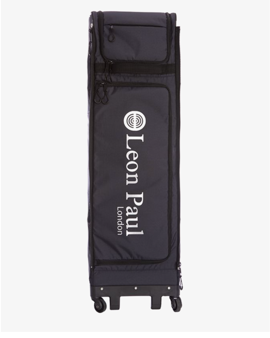
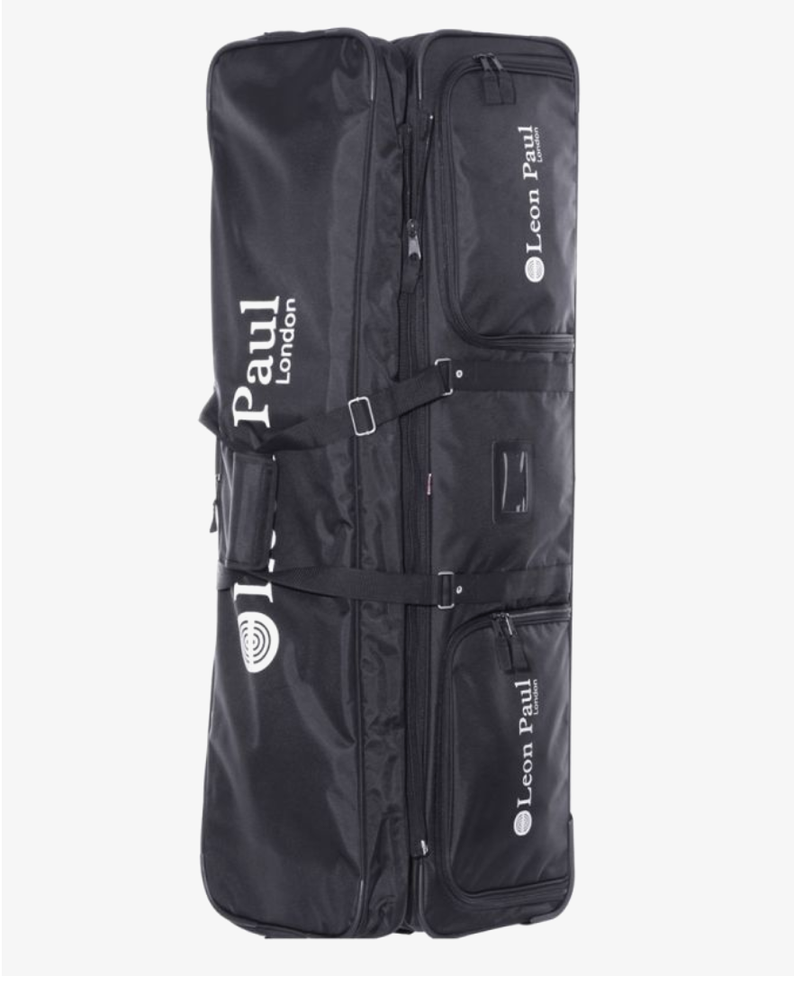
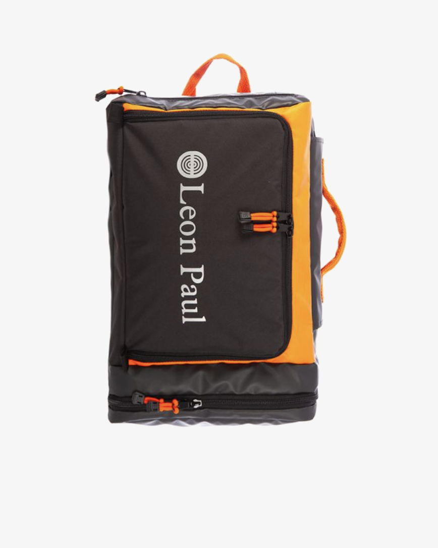
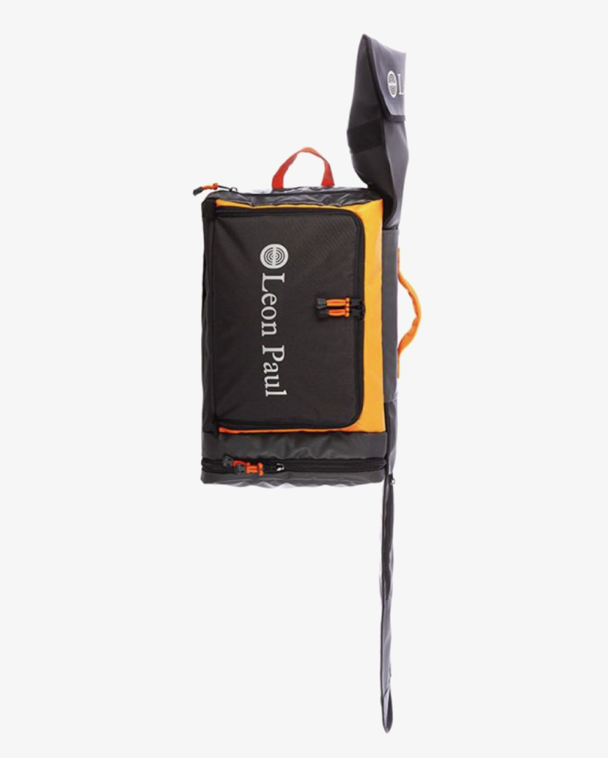
Variants left to right: grey eyebrow + price range · green eyebrow · no eyebrow (hairline stays, title aligns) · sale (red price + struck-through original — sale treatment proposed, confirm against live).
Mobile (390px, 2-up)
Apex FIE Mens Jacket
£314.20Inc VAT
Apex FIE Mens Breeches
£232.40Inc VAT
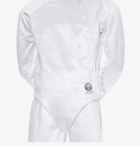
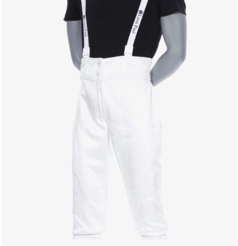
Hover state — desktop
The Apex Bag
£364.70 - £504.60Inc VAT
Shop
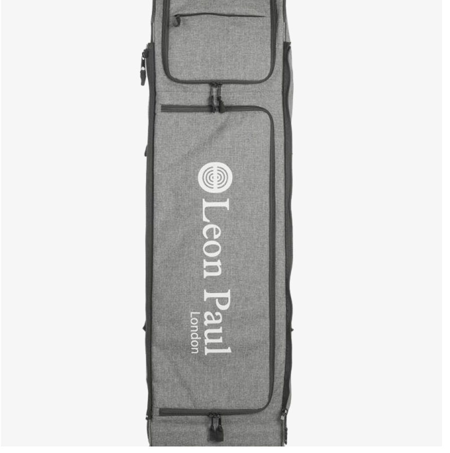
On hover a black Shop pill appears below the price. The rest of the card is unchanged — no shadow, border or zoom.
Press state — mobile
Duo Backpack
£83.30Inc VAT
Shop
Apex FIE Mens Jacket
£314.20Inc VAT
On mobile there is no hover — the black Shop pill appears on press (left card shown pressed; right card at rest).
Country selector
Circular flags in 44px discs with bold country names. The selected country carries a tick and a light grey row fill.





Iconography
The icon set is Feather — full set at feathericons.com. 24px viewBox, stroke-width 2, round caps and joins, currentColor, rendered at 14–22px. Never filled, no emoji.
search
help-circle
user
heart
shopping-cart
truck
chevron-down
menu
x
check
Spacing & grid
A 4px base scale. Pages max out at 1440px with 48px side padding (20px on mobile); sections take 64–96px vertical padding.
4
8
12
16
24
32
48
64
96
Corner radii
9999px — buttons, chips, count badges, flag discs
10px — text inputs and dropdowns
5px — image tiles and panels
10px — text inputs and dropdowns
5px — image tiles and panels
Layout
Max width 1440px · gutters 22–40px
Side padding 48px desktop, 20px mobile
Product grids: 3–4 columns desktop, 2 mobile
Max 1–2 dark sections per page
Side padding 48px desktop, 20px mobile
Product grids: 3–4 columns desktop, 2 mobile
Max 1–2 dark sections per page